QuindeLove
Logo Design
Visual Identity (work in progress)
Quindelove is a creative lab located in Los Angeles.
I wanted to share the creative process and creative rational behind the logo, inspired on the copy we currently have on the website:
Hola!
Welcome to QuindeLove.
We are a Creative Lab.
With lots of love. :) .
We are also a work in progress
and currently under construction…
go ahead, look around.
Welcome to QuindeLove.
We are a Creative Lab.
With lots of love. :) .
We are also a work in progress
and currently under construction…
go ahead, look around.
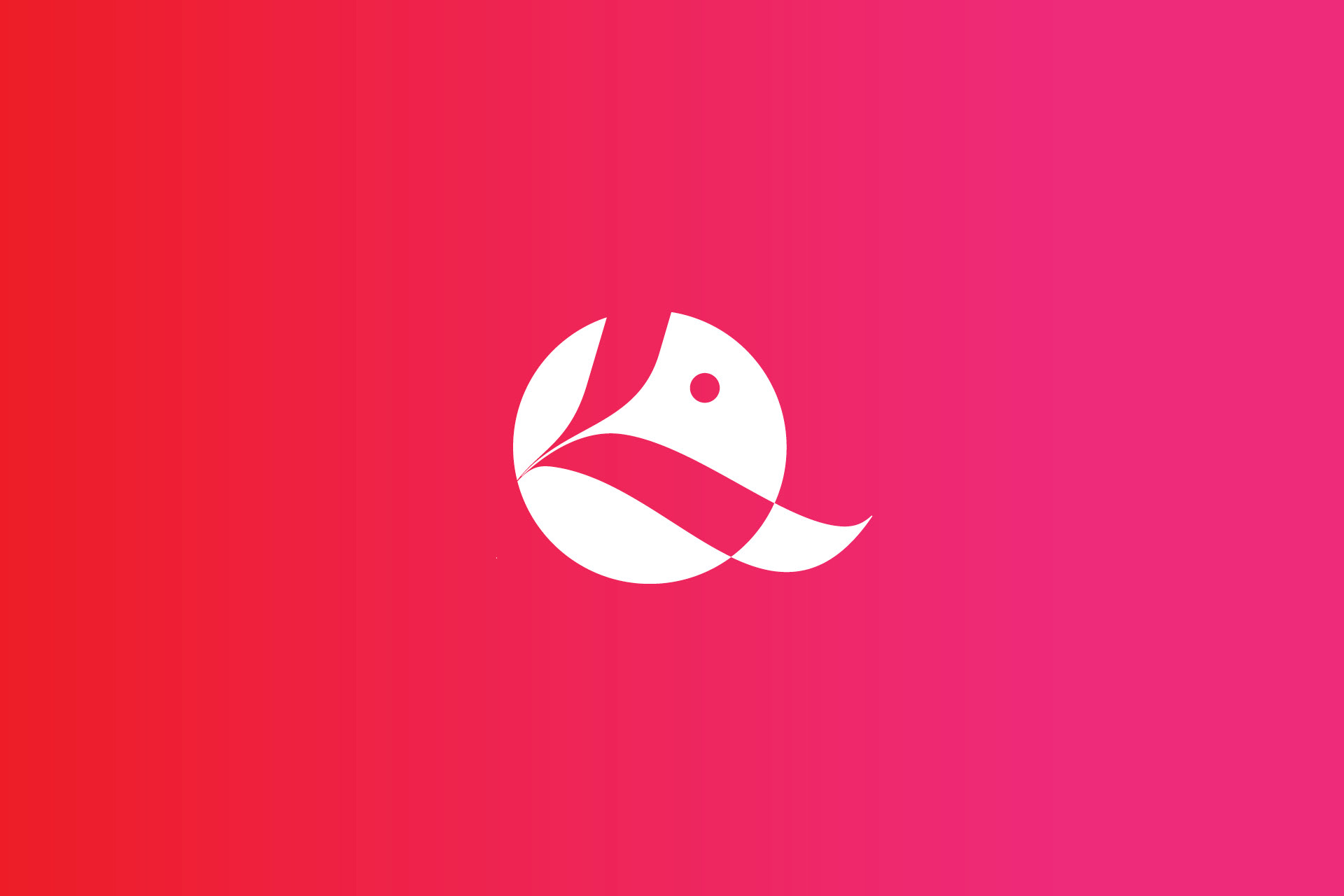
Wondering what “Quinde” is?
“Quinde” means hummingbird
in Quichua, a native language
from Ecuador.
And Love?
Well, Love is Love.
“Quinde” means hummingbird
in Quichua, a native language
from Ecuador.
And Love?
Well, Love is Love.
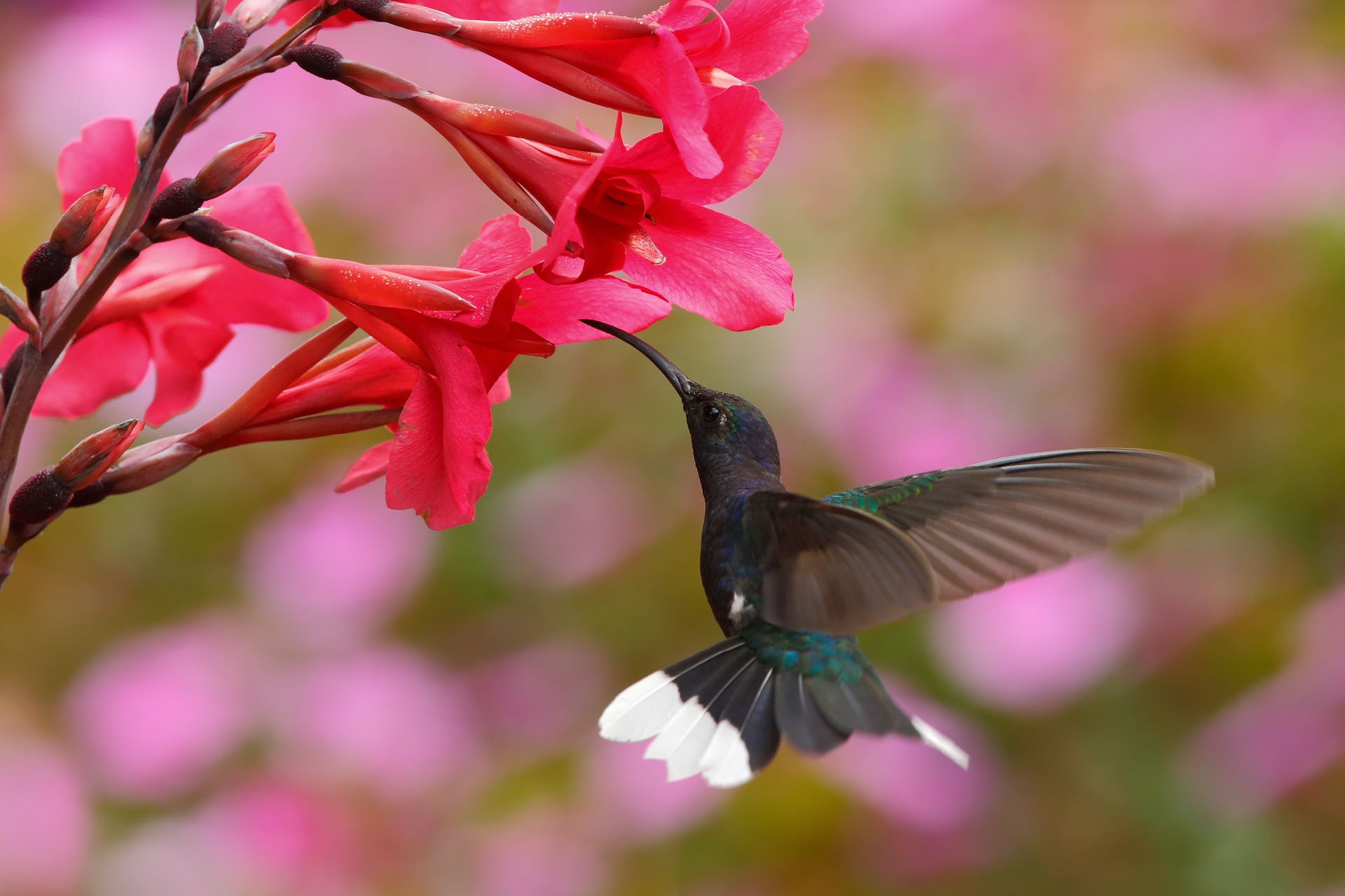
In the beginning of the creative process we look to lots of pictures of hummingbirds ...
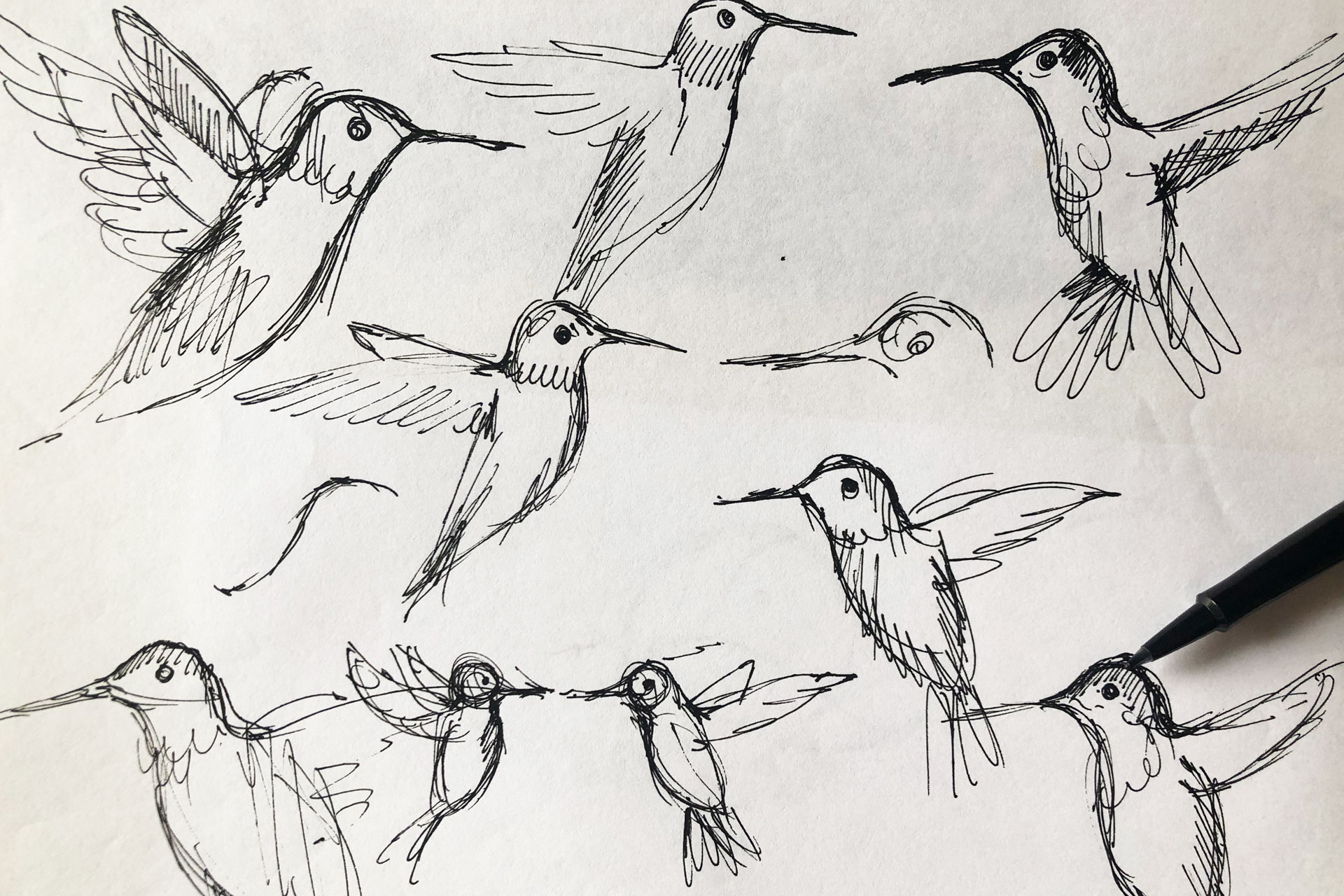
And I did tons of sketches, to get familiar with its forms, shapes and movements...
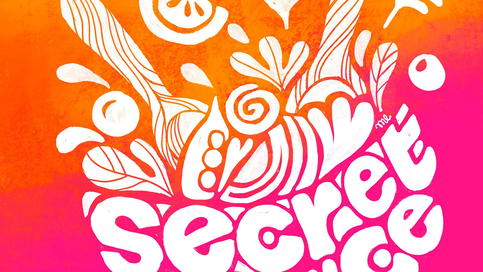
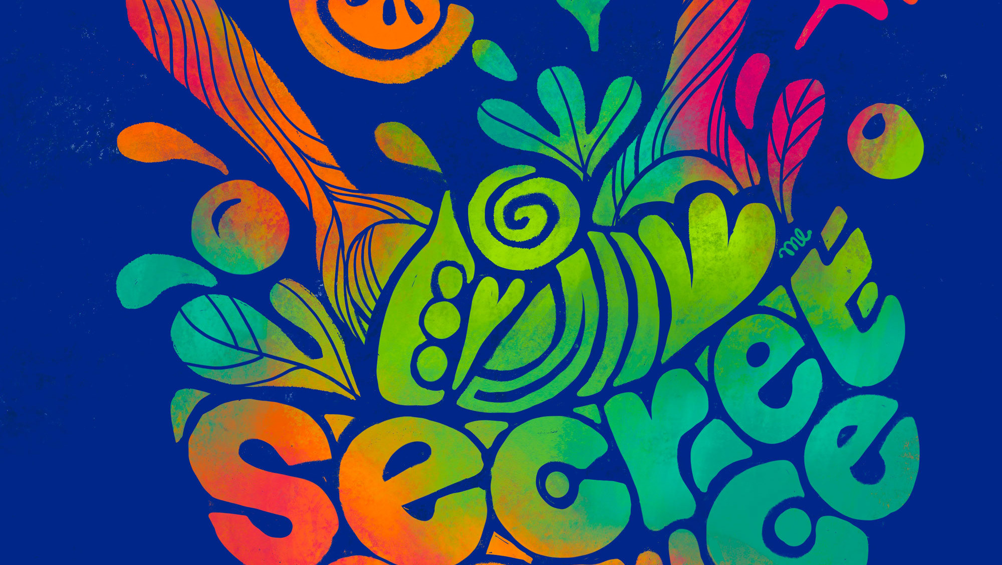
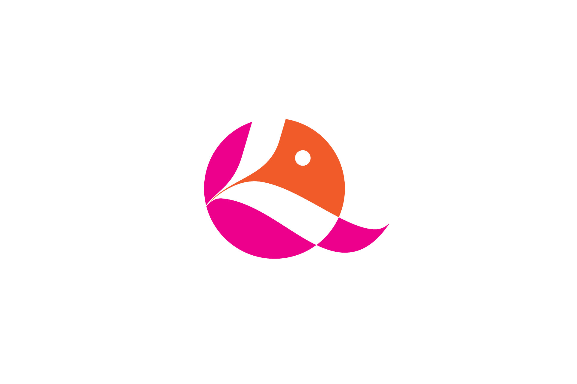
After that, I started the typography studies and experimentations, and here below is a simplified demonstration of the final solution. Hope you like it.
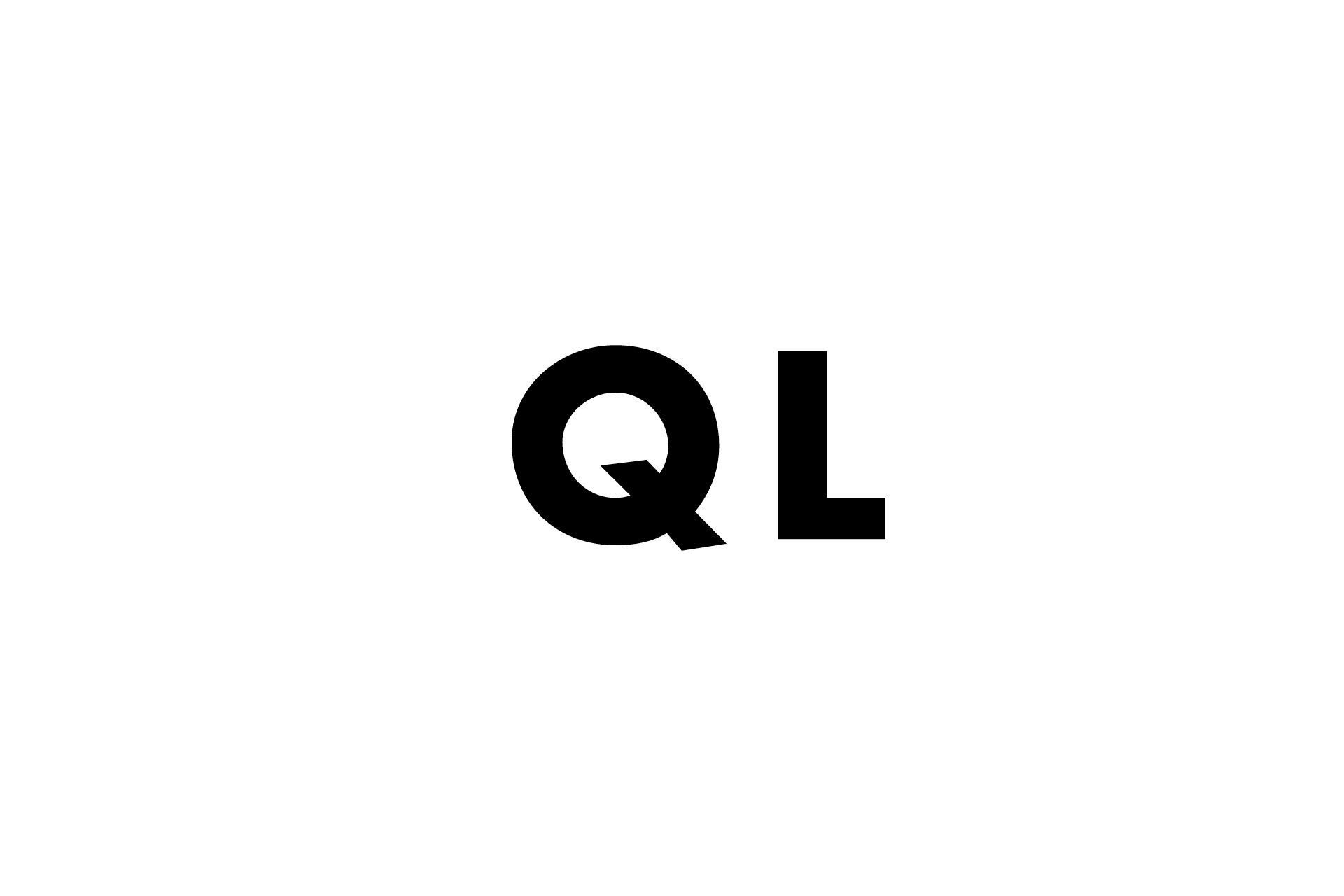
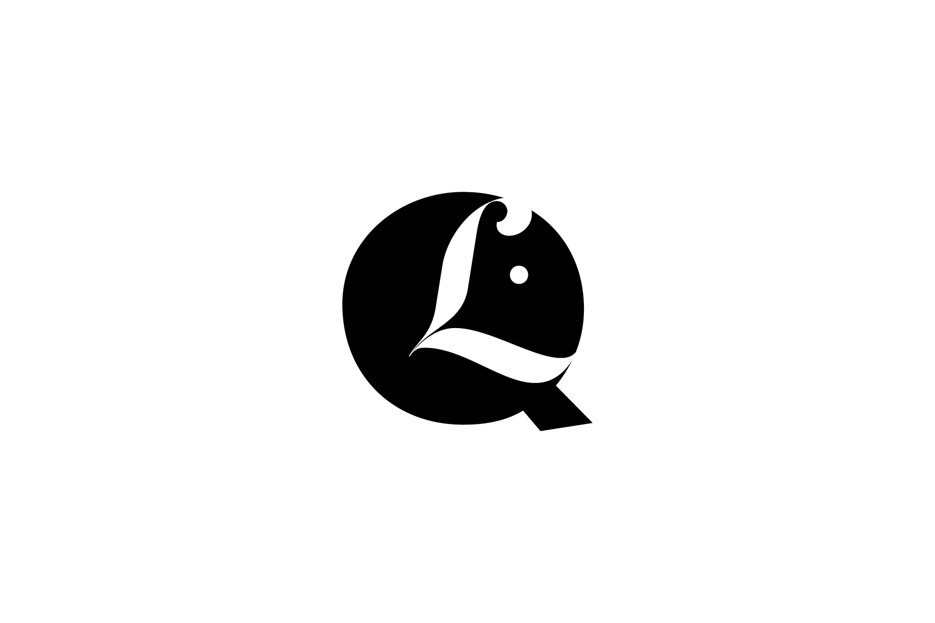
We had two words "Quinde" and "Love". This is Futura STD.
I combined Futura with Lust Script Display to achieve more movement and the L looked like a heart.
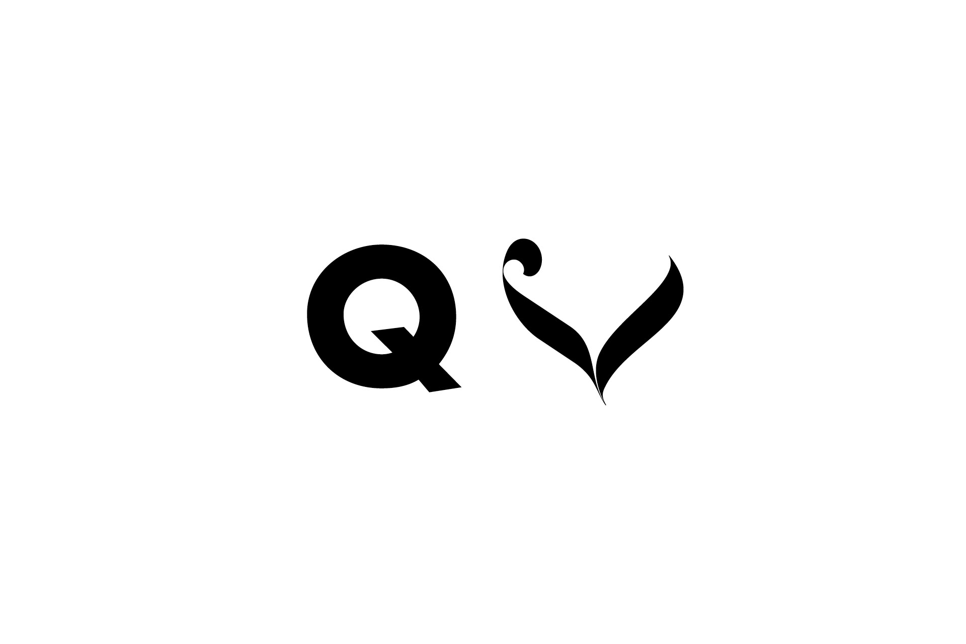
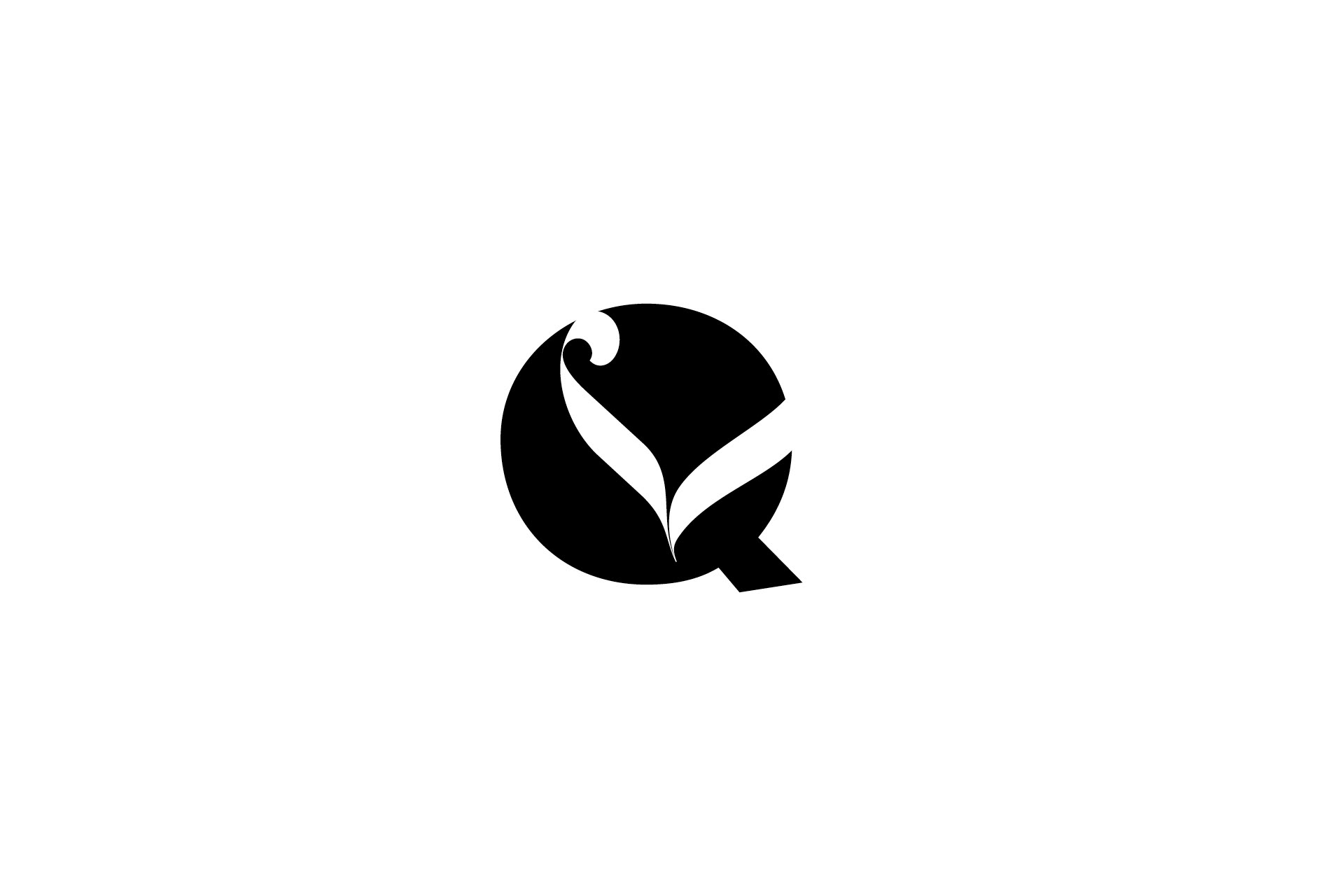
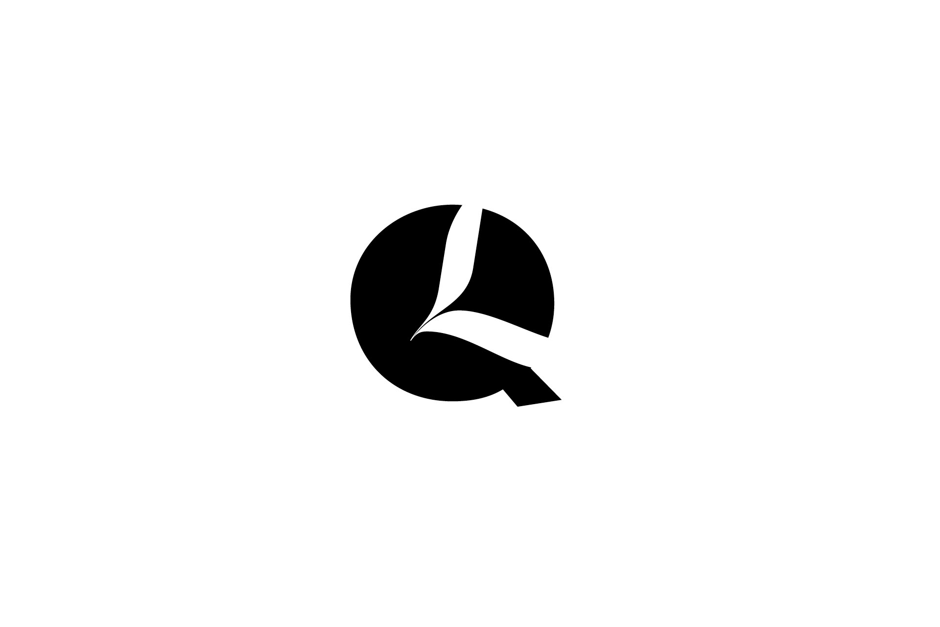
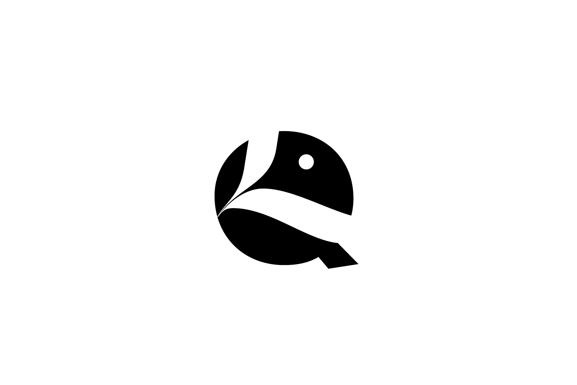
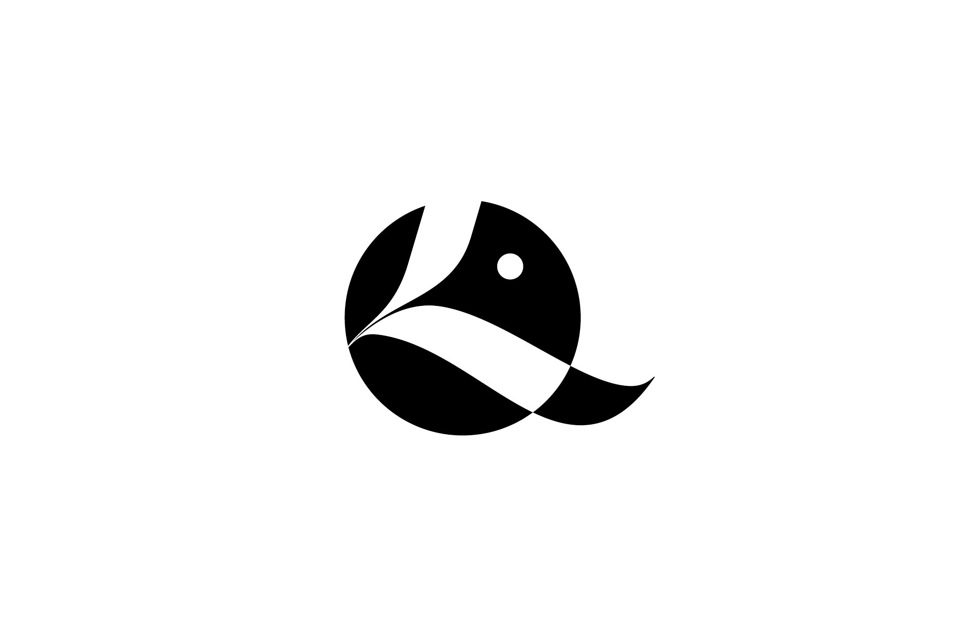
... when turning the "L" I started to see something...
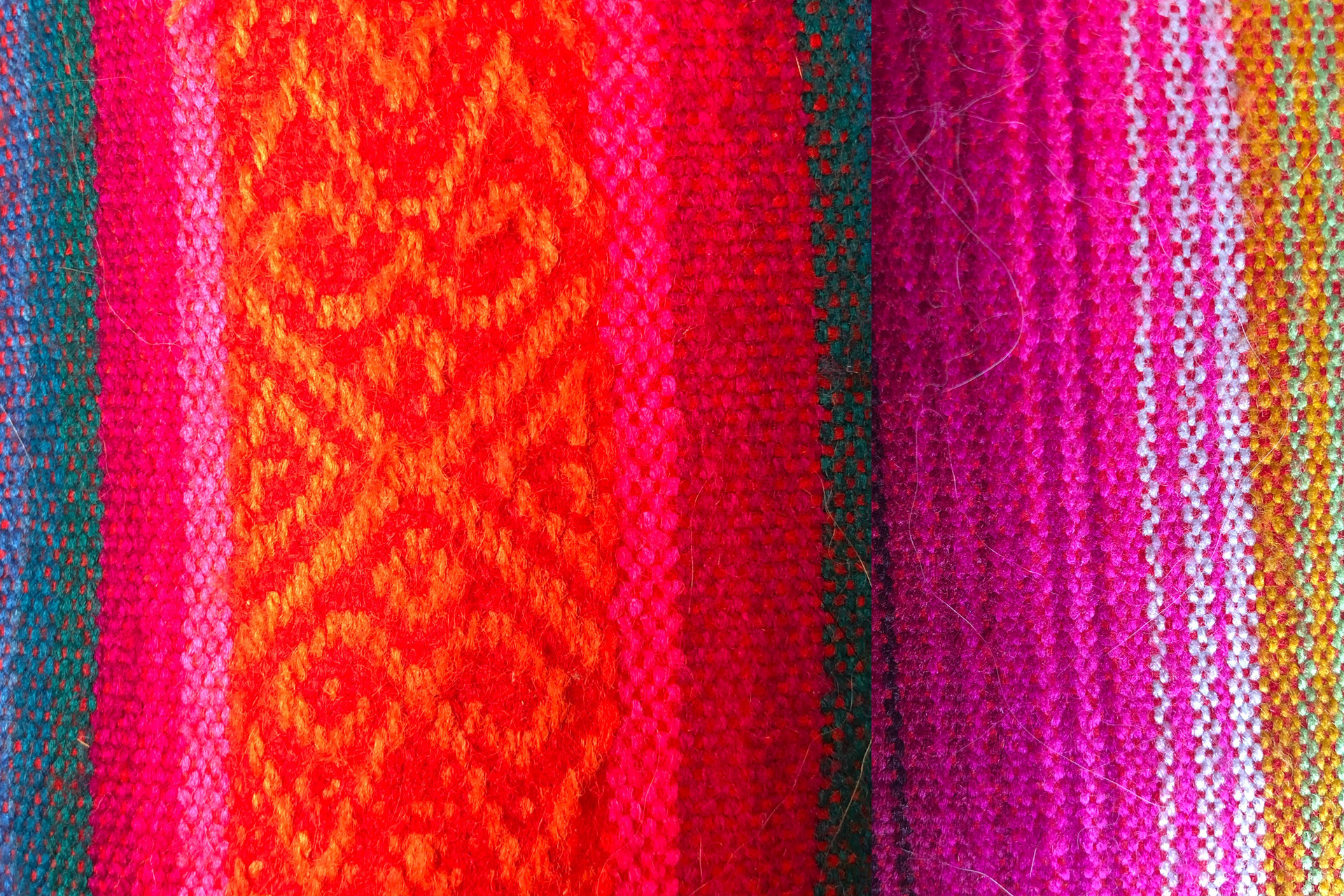
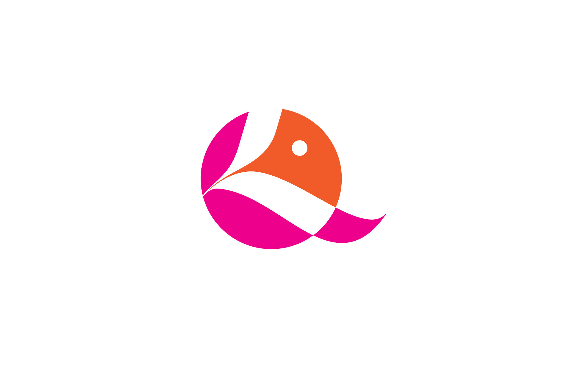
The color palette is inspired on the ecuadorian textiles we have on the living room.
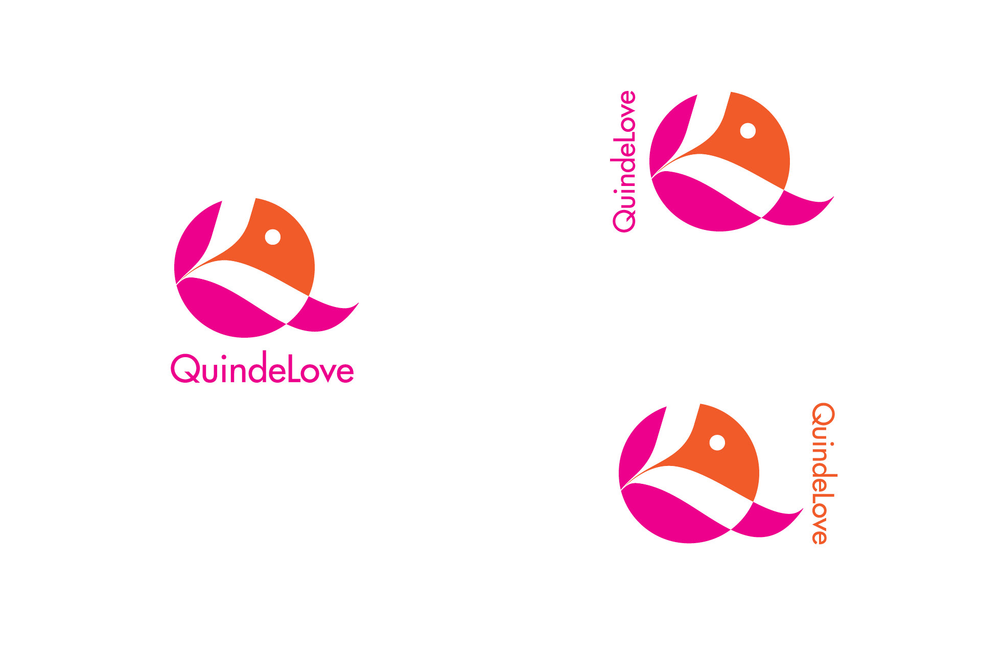
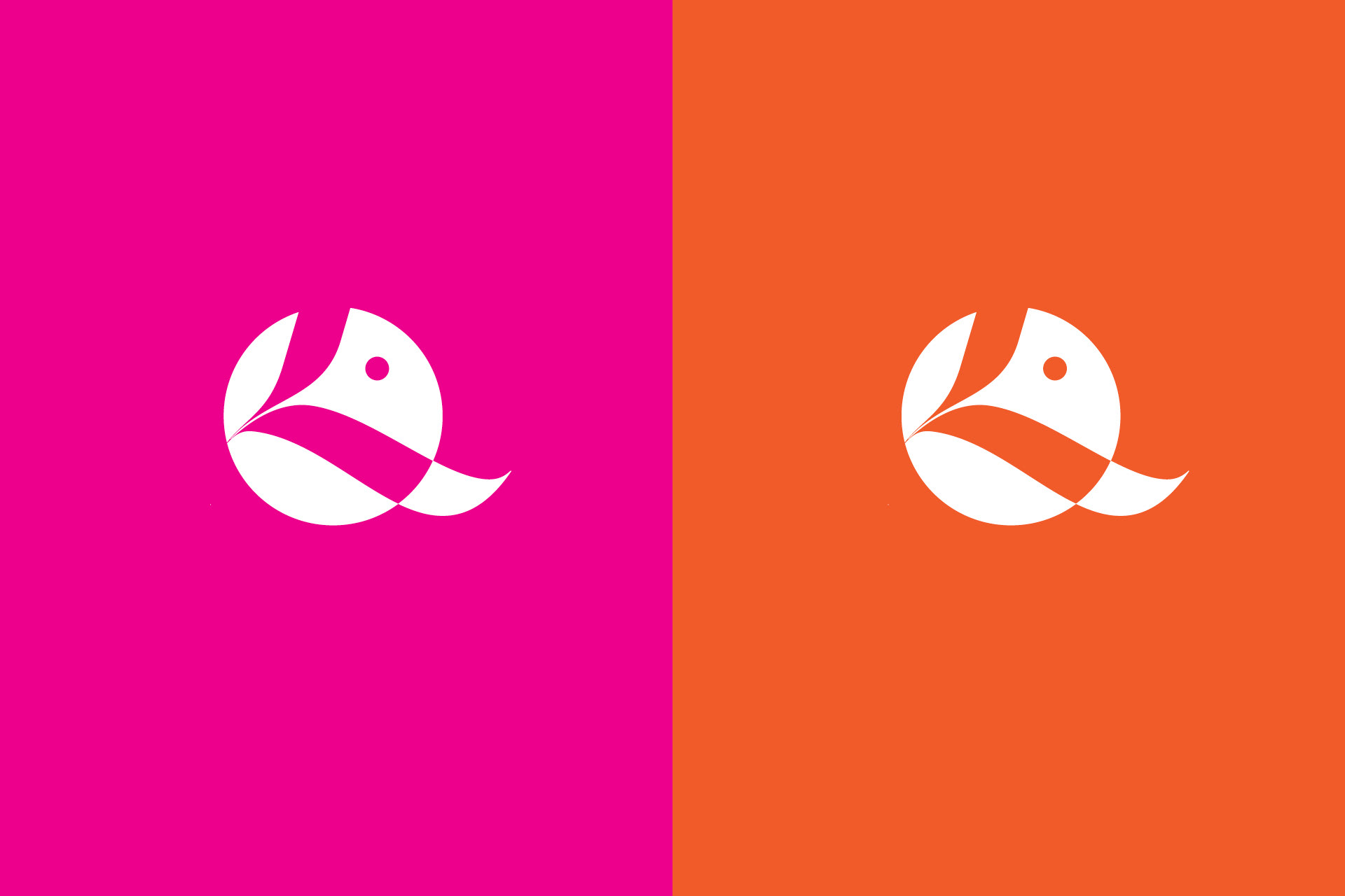
The signatures are flexible and playful depending on the application.
Thanks for watching and hope you liked it!
You can also follow me on my ig @marialoor.art.design to check out more of my artwork
or it would be lovely if you visit my shop and get yourself something pretty. :)